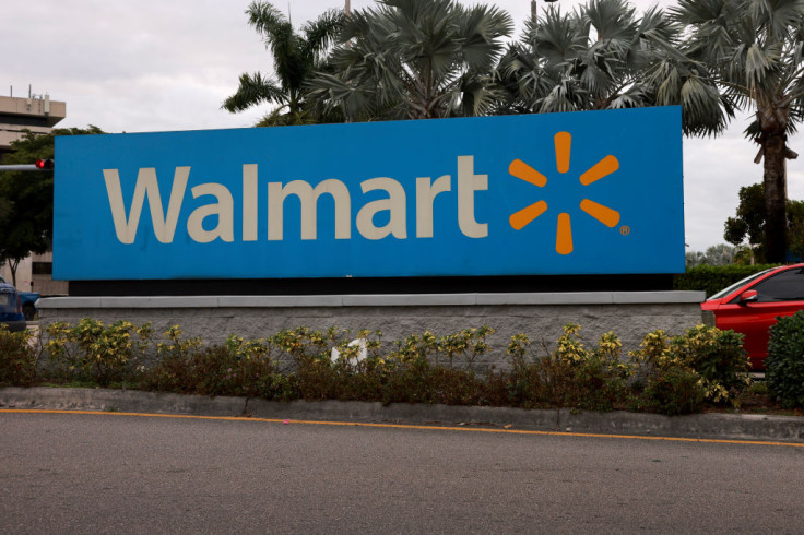
Walmart's First Logo Change In 20 Years: Here's What You Need To Know

Get ready to experience the new fresh look of Walmart as the retail giant introduces a new brand identity that is meant to further solidify its position in the fast-changing retail business and ensuring a delightful experience shopping experience for customers.
The new updated brand identity of Walmart is a fusion of the character that shaped the company for more than half a century, and the kind of retailer that present modern consumers enjoy. Hence, one can feel that the company continues to honor its roots, and at the same time provide innovative solutions to make the shopping experience a pleasurable one.
According to CNN, the new logo is the "first facelift" that it got in 20 years.
Walmart is not immune to the changing shopping landscape in the U.S. It also evolved to meet the needs of consumers without sacrificing the affordability of its offerings, even adding more services in the process.
"This update, rooted in the legacy of our founder, Sam Walton, demonstrates our evolving capabilities and longstanding commitment to serve our customers of today and tomorrow," said William White, senior vice president and chief marketing officer of Walmart US, in a statement.
The updated brand identity will help Walmart build credibility and connection, become known for its convenient digital-first services and be seen as a more modern, culturally dynamic brand.
Walmart plans to apply the updated brand across channels, from its website and app, stores and new Home Office opening in Bentonville, Arkansas in January 2025. The retailer has started to roll out the process in October 2024, starting with Store 4108 in Springdale, Arkansas. The rest of the stores will also be redesigned over time.
The official launch of the new and updated brand will be done on Walmart.com, as well as the Walmart app. In January, the new refreshed look would also be rolled out across marketing campaign assets, and the rest of the assets of the company spread throughout the year.
So what are some of the things that consumers could expect from the fresh look? Key points on the brand's refresh are as follows.
1. Sam Walton's classic trucker hat inspires the wordmark of Walmart. A unique modern custom font was used for it, which would set the company apart from the rest of brands.
2. The spark is representative of the energy of the company. It continues to be the guiding light that customers could always refer to. Customers would have this beacon guiding them in every Walmart experience.
3. Walmart's color palette comprising of True Blue and Spark Yellow is anchored on the iconic colors of the company. It retains the identity of Walmart, and at the same time provides a promising fresh brand.
4. The tone of the fresh brand is presented to be relatable and approachable. It is representative of the company's millions of customers, whether it is conveyed through illustrations, photos or brand voice.
Originally published on IBTimes
© Copyright IBTimes 2025. All rights reserved.


